BASE · Telco · B2C · 2025 · 1 sprint to launch · adopted across other journeys over 2 quarters
Converting prepaid customers
to postpaid through segmentation
Digital pre-to-post migration had been declining for months. No conversion flow existed. I redesigned the prepaid pages using segmentation to serve the right message to the right user at the right moment.
Sole Product Designer. Owned full process — funnel analysis, segmentation strategy, design, stakeholder alignment, launch. Worked with PM, dev, marketing, analytics.
Figma · Adobe Analytics · ContentSquare · Qlik
BASE's prepaid page treated every visitor the same. A loyal logged-in prepaid customer saw the same page as a prospect who'd never heard of BASE. No migration flow, no personalised value proposition, no nudge toward postpaid.
Migration had been declining since April 2025. The business cost was clear: every prepaid customer who didn't migrate was a missed opportunity for higher-value subscription revenue — and a missed gateway to Internet and TV upsell.
Convert existing prepaid customers into postpaid — BASE's primary product and the gateway to upselling Internet and TV. Every converted customer has significantly higher lifetime value.
14,708 total migrations across all channels in period · digital accounted for 3,077 of these (Jul–Oct) · top plans: BASE 15 (5,719) and BASE 20 (4,215)
If we serve segmented, relevant content to the right audience at the right entry point — prepaid customers see migration offers, prospects see prepaid as an easy entry point — conversion and migration rates will increase.
Analytics showed a clear behavioural pattern: digital pre-to-post migrations had declined from 801 in January to 571 in June — a 29% drop — while 47.7% of prepaid journeys still led to low-value top-ups, and only 4.62% reached postpaid pages and 0.23% the configurator.
Qualitatively, the recurring signal from customer-facing teams was that customers didn't necessarily understand why switching to postpaid was better for them. The barrier wasn't awareness of monthly plans — it was perceived value, especially once someone was already in the habit of topping up.
I wouldn't frame this as formal qualitative research — no dedicated interviews were run for this project. It was directional input from customer-facing teams combined with strong quantitative evidence, which was enough to define and ship the first iteration within one sprint.
Based on these signals, I prioritised three intervention points where conversion opportunity was highest:
Prepaid page — logged-in customers
Direct intent signal. Highest relevance for migration push.
Top-up page — logged-in customers
Highest traffic from prepaid users. Moment of transaction = moment of consideration.
Home page — prepaid segment
Users already in consideration mindset. Hero-level messaging opportunity.
Same URL, completely different first screen. Segmentation worked inside a single component via login state — no redirects, no new pages, no new code.
Logged-in prepaid user saw their current plan vs what postpaid would give them. Direct comparison, promo applied, CTA straight to configurator with plan pre-selected.
Prospect / not logged in saw prepaid as a low-friction entry point. No migration pressure. Simple pricing, fast activation.
Built entirely within existing components — no new development needed. 1 sprint from brief to launch.
Design — selected screens
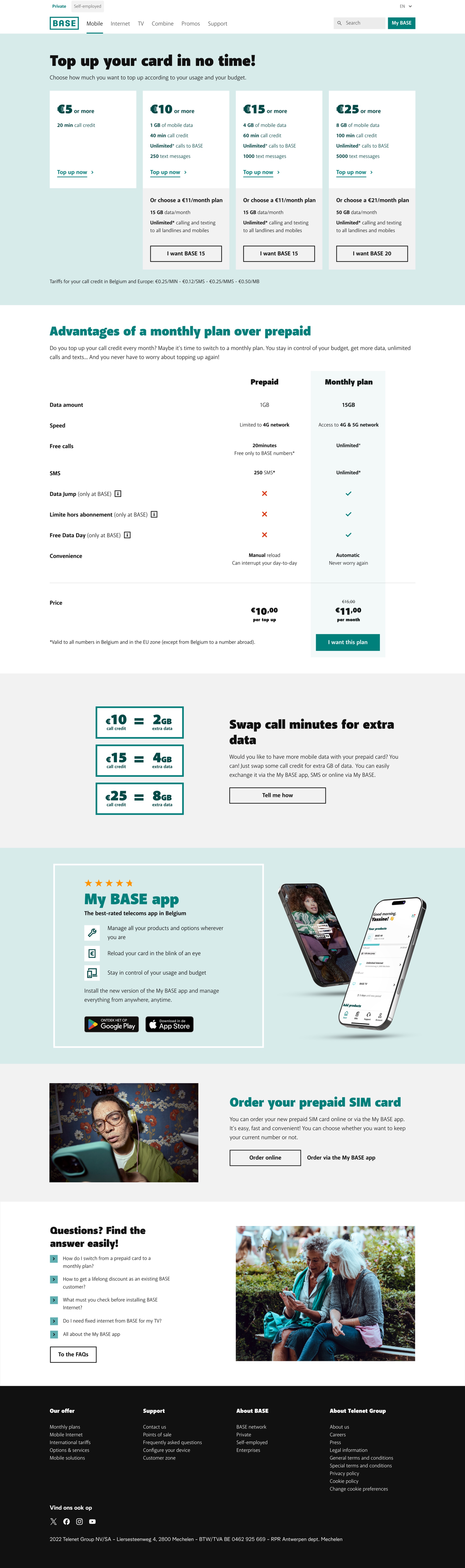
01 — Prepaid page (logged-in prepaid customer)
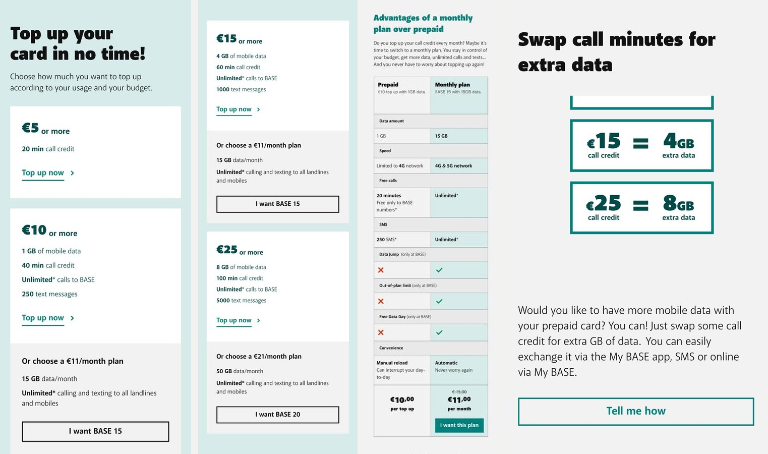
Push toward migration: top-up options shown alongside "I want BASE 15/20" CTA. Comparison table prepaid vs monthly plan makes the value gap concrete.
Mobile version
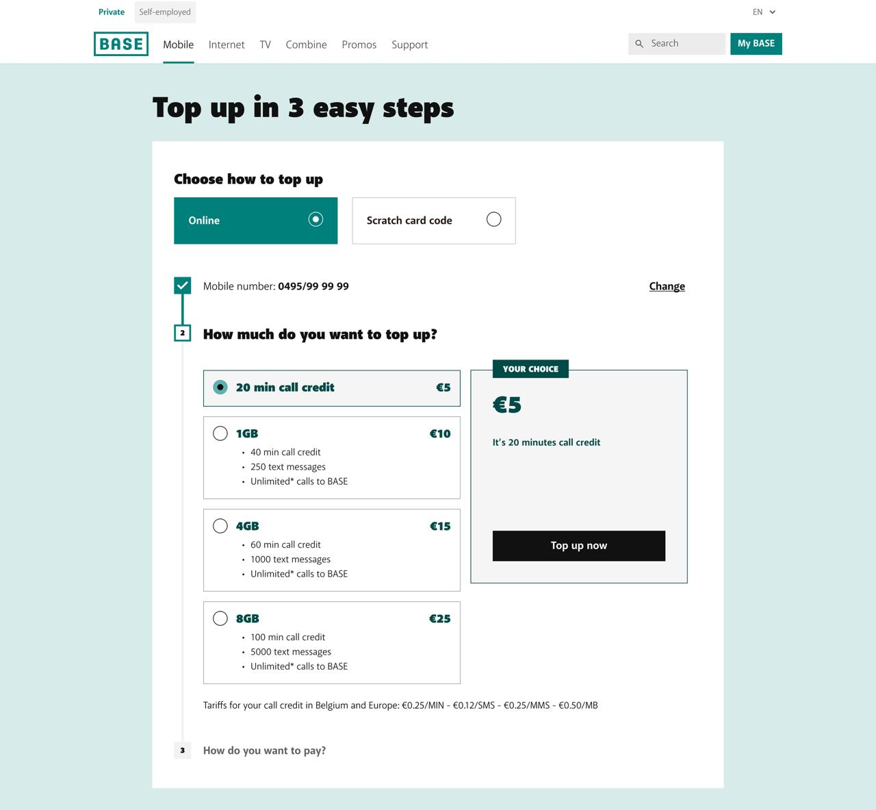
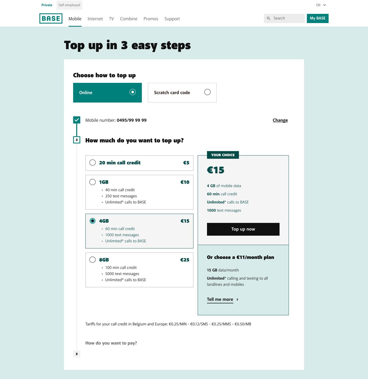
02 — Top-up page (logged-in prepaid customer)
Standard top-up flow with migration nudge. Users in transaction mode — shown what they could have instead. When the user selects a top-up amount, we surface the equivalent postpaid offer alongside it — turning the transaction moment itself into a comparison point.
03 — Home page (segmented for prepaid)
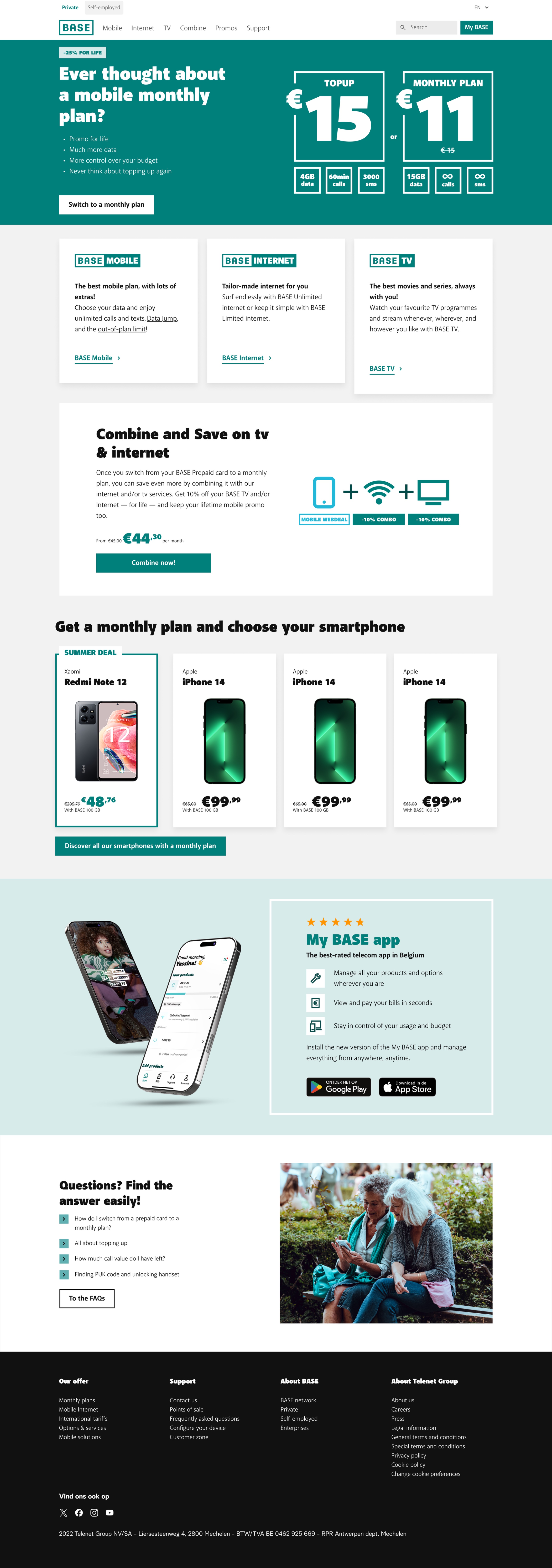
Most direct conversion screen: hero with −25% for life promo, €15 top-up vs €11 monthly plan comparison, "Switch to a monthly plan" CTA. Also surfaces Internet & TV upsell opportunity.
Why segmentation instead of a dedicated migration page?
A separate page would require users to find it. Segmentation meets users where they already are — at the moment they're already thinking about their plan. No extra navigation, no extra intent required.
Why show the price comparison in the hero?
The core barrier wasn't awareness — users knew monthly plans existed. The barrier was perceived value. Showing €15 top-up vs €11/month with more data made the decision concrete, not abstract.
How did we resolve marketing wanting more visible promotion vs UX wanting restraint?
Marketing naturally wanted the promotional message highly visible everywhere; from a UX side, I didn't want every prepaid interaction to feel like an aggressive sales moment. The resolution wasn't "marketing vs UX" — it was aligning around intent: prospects still saw prepaid as a simple, low-friction product, while logged-in prepaid customers — higher-intent by definition — saw the explicit €15 vs €11 comparison and a direct migration path. Message intensity followed customer intent, not a single volume dial for everyone.
From a page problem to a journey strategy
A dedicated migration page was one option on the table. I challenged it using behavioural data: our highest-intent prepaid customers were already on the prepaid and top-up journeys. Rather than creating another destination, I proposed bringing the proposition to them — comparing both approaches with stakeholders across user, business, and implementation angles, which shifted the discussion from "which page should we build?" to "where is the best moment to influence this customer?"
I aligned Product, Marketing and Development around one principle: message intensity should follow customer intent.
I wouldn't call what followed a formal design-system pattern — it was more of a product strategy principle. After this project showed measurable impact, the same thinking — same entry point, different proposition based on what we already know about the customer — started getting applied to other BASE journeys, particularly logged-in and Internet experiences, over the following two quarters. Segmentation began being considered earlier in the design process rather than defaulting to one generic page per audience.
This wasn't run as a formal A/B test — no holdback group, so I can't claim clean causality. Three things make the correlation credible rather than coincidental:
Digital pre→post migrations by month
New segmented page GO LIVE — July 2025
Before — June 2025
After — July 2025
Commercial impact
14,708 customers migrated across all channels Jul–Oct; digital contributed 3,077, improving after launch. Shifted more prepaid customers toward recurring subscription revenue and Internet & TV cross-sell potential.
Behaviour
Top-up journeys dropped 38%. Users redirected toward postpaid pages and configurator — intent confirmed by 3 tools
What I'd do differently
Set up a proper A/B test framework before launch. We measured correlation well — but formal experimentation would have made causality bulletproof
What I learned
Segmentation worked best as a product principle, not a campaign tactic. Matching message intensity to customer intent improved performance without turning every touchpoint into a sales surface — a principle we later applied to other journeys